Product Dashboards: 101
If you have never checked out the Data is Beautiful sub-reddit - it is a great place to watch other people make some incredible and not so incredible visualizations - both of which create learning opportunities.
Edward Tufte
- Chart Junk
- Data is the art just have to figure out how to encode the data in a pleasant and sensible manner.
- Pictograms
Principles:
- Show the Data
- Induce the viewer to think about substance rather than methodology
- Avoid distorting what the data says itself
- Encourage the eye to make comparisons within the data
- Reveal the data at varried levels of detail - overview to fine detailed structure appreciateion
- Serve a clear purpose
Examples:
E. J. Marey Train Schedule for Paris 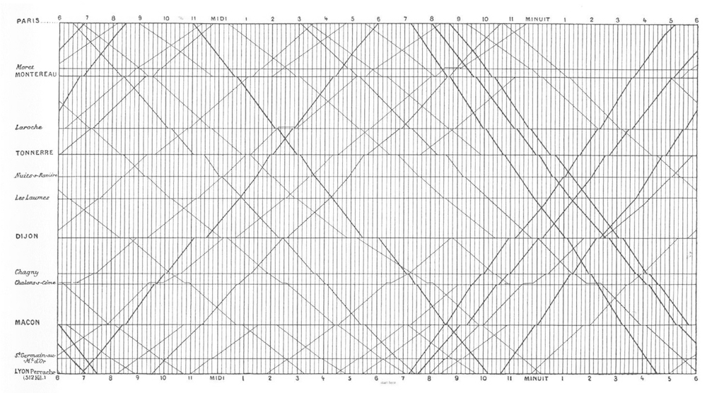
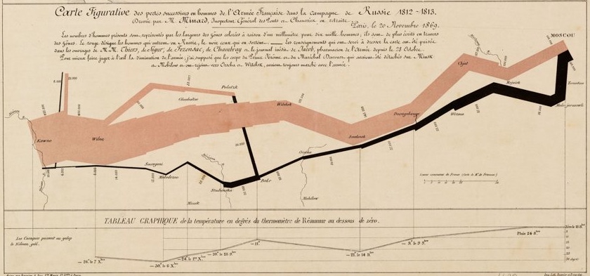
CJM Napoleon Conquest 
CJM Wine Trade Diagram 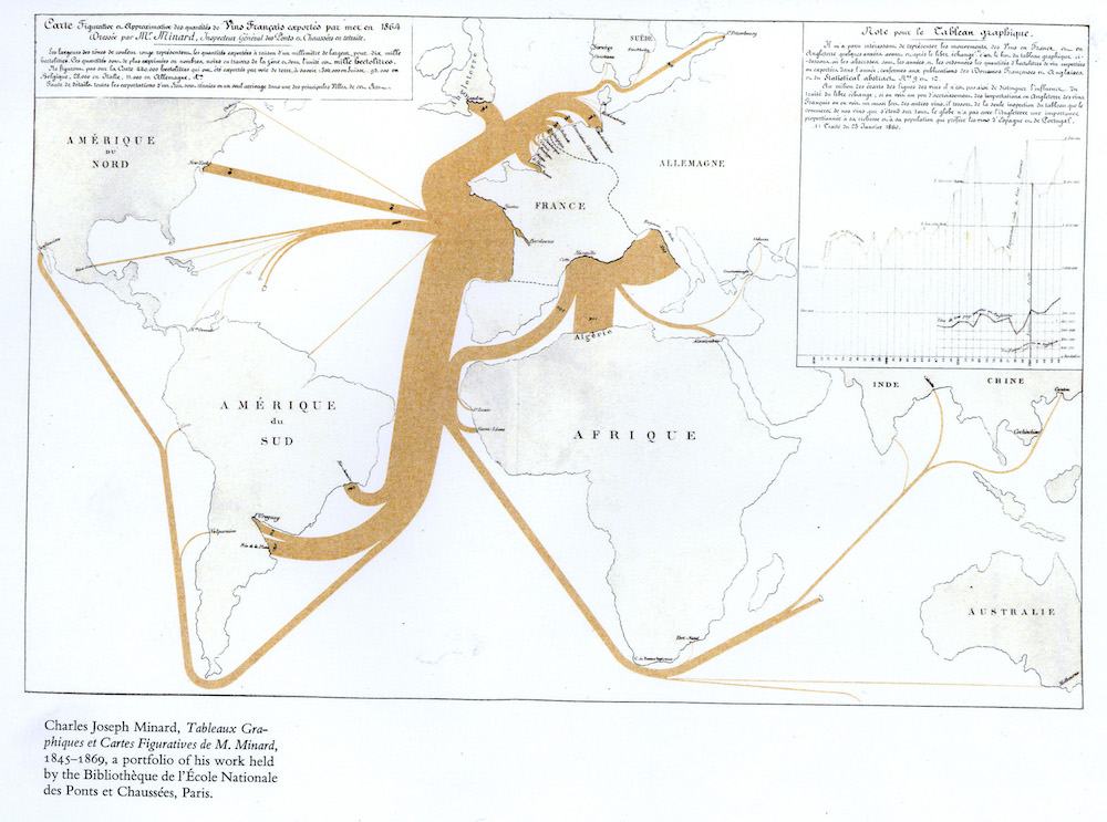
Stephen Few
- Sparklines
- Bullet Charts
- Hi/Low Status Indocators